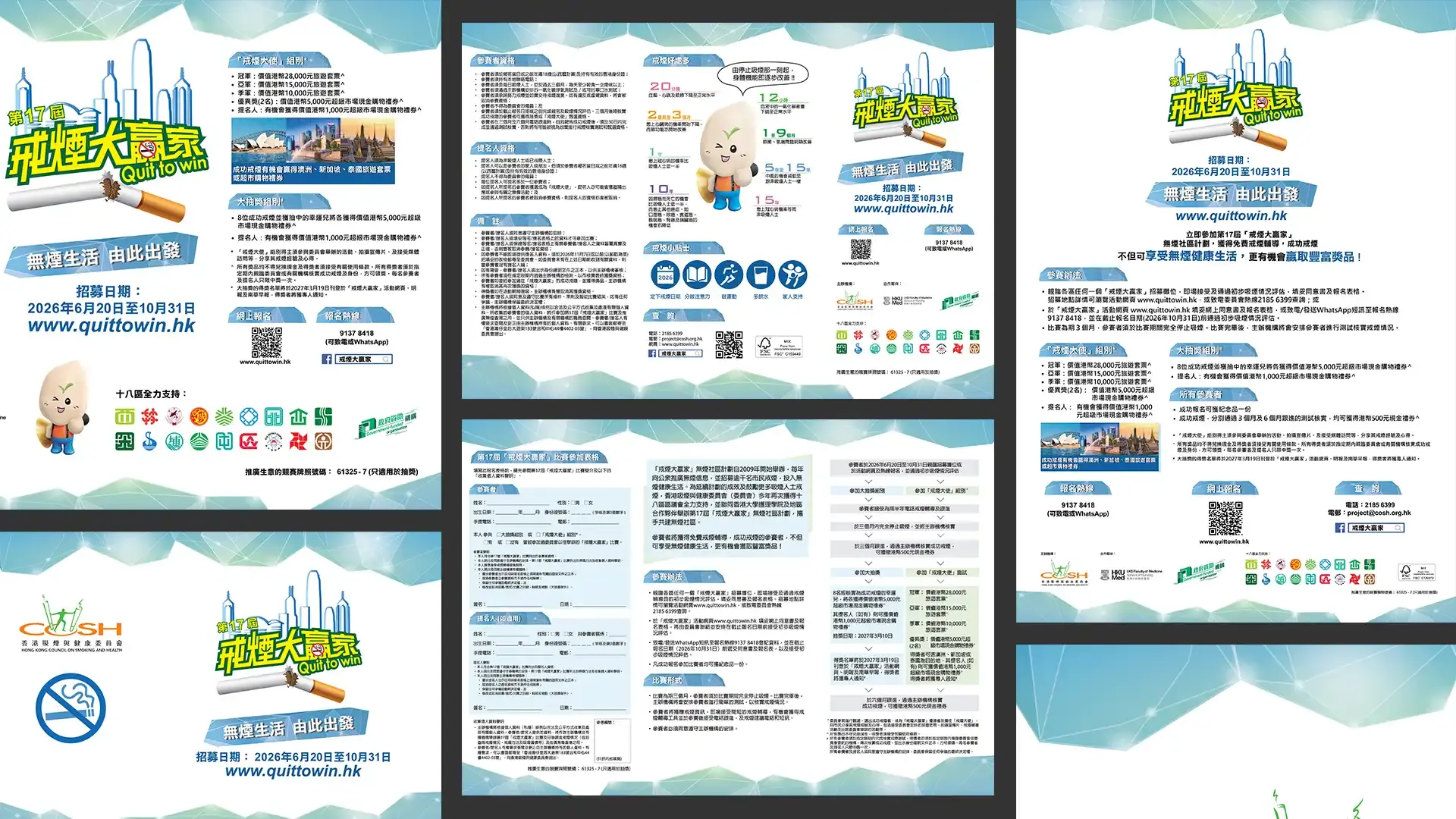
Quit To Win Event
This project designed event materials for the Hong Kong Council on Smoking and Health across print and digital media. By simplifying public health information and unifying the visual style, the design combined official clarity with modern graphics to improve readability and communication impact.
Client
Hong Kong Council On Smoking And Health
Date
Jun 15, 2026
Author
UC DESIGN LAB
Location
Hong Kong
Background
This project involved the design and production of event materials for the Hong Kong Council on Smoking and Health. The materials were created for different public health campaigns and activity formats, covering both printed and digital applications.
As the content focused on smoking control, health education, and public communication, the design needed to present information in a clear, trustworthy, and official manner. At the same time, modern visual elements were introduced to make the materials more engaging and easier for the public to understand.
Design Problem
The main challenge of this project was to organise a large amount of public health information while maintaining a consistent visual identity across different media. The design needed to address several key issues:
Complex health-related information had to be simplified and structured clearly
Different event materials needed to maintain a unified visual identity
The overall tone had to feel official, credible, and professional
The design also needed to avoid looking too rigid or outdated
Different media formats required flexible layouts and adaptable visual systems
Key messages had to be easy to read, understand, and remember
The core challenge was to transform public health information into a clear, unified, and visually engaging communication system.
Design Positioning
The project was positioned around the idea of official clarity with contemporary visual elements. The design retained the structured and credible qualities of public health communication while introducing more modern graphic treatments.
Through clear layouts, information hierarchy, simplified icons, colour zoning, and modular visual systems, the materials organised complex messages into a more readable format. The visual identity was applied consistently across different media, ensuring that posters, leaflets, event panels, digital graphics, and other materials shared the same tone and visual language.
This approach allowed the design to remain professional and trustworthy while improving readability, recognition, and audience engagement.
Conclusion
This project used information organisation, visual hierarchy, and cross-media design adaptation to create a clear and unified visual system for the Hong Kong Council on Smoking and Health’s event materials.
By combining an official communication style with fresh graphic elements, the design improved the readability and accessibility of smoking control and health-related messages. It also strengthened the consistency and communication impact of the materials across different public-facing applications.