
"FAyeMAnS" Brand Identity
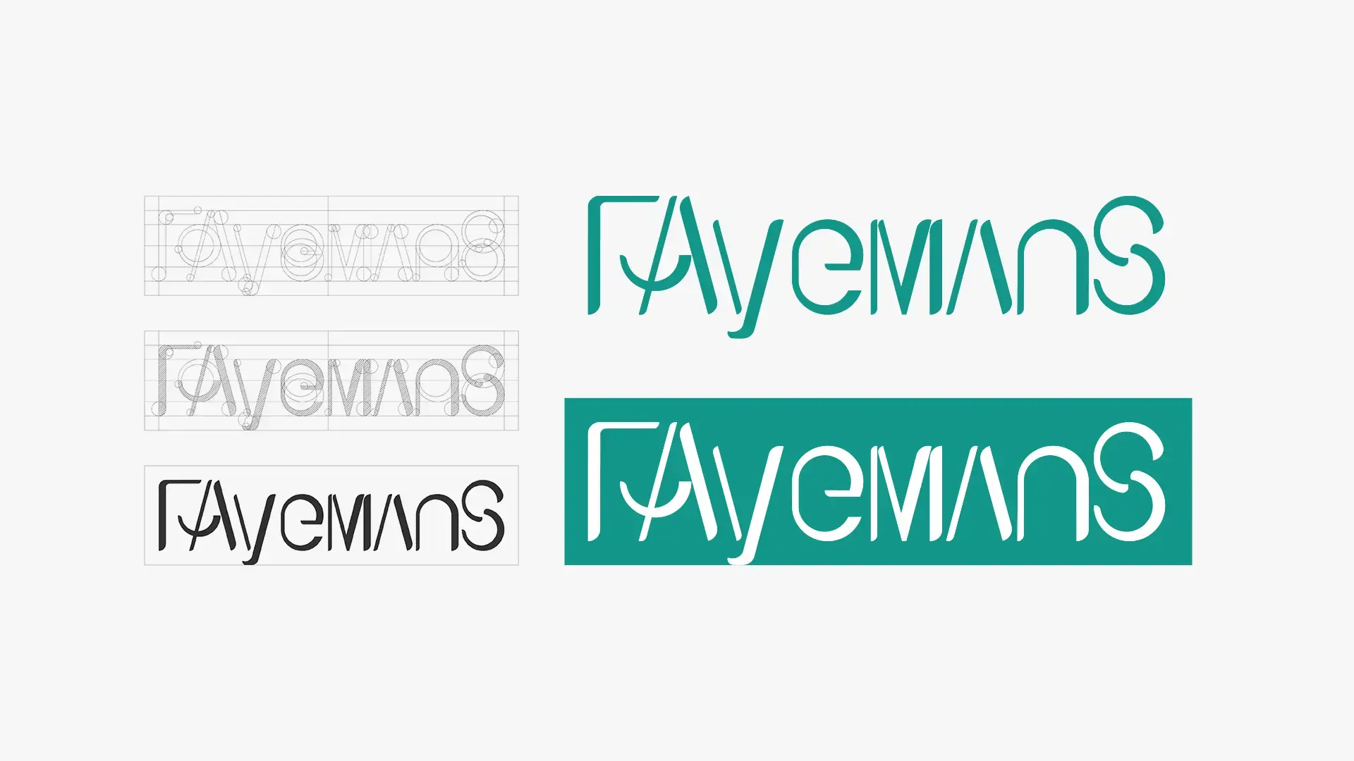
FAyeMAanS encodes family legacy—Father (FA), Mother (MA), Surname (S), and daughters (Faye & Man)—into a custom wordmark paired with birthdate-derived color coding.
Client
Own Project
Date
Aug 10, 2026
Author
UC DESIGN LAB
Location
Hong Kong
Background
This project involved the brand identity design for FAyeMAanS, a lifestyle product brand founded on the core values of family cohesion, lineage, and fatherhood. Created by a father inspired by his two daughters, Faye and Man, the brand required a distinctive, emotionally grounded, and adaptable visual identity that could be applied consistently across lifestyle products, packaging, and digital touchpoints. The design focused not only on the aesthetic appeal of the logo, but also on transforming a personal family narrative into a precise, structured visual symbol. By aligning the brand concept, name origin, typographic hierarchy, and color system, the project aimed to build a visual identity that was organized, meaningful, and deeply narrative-driven.
Design Problem
A common issue in personal or story-driven logo design is that the final mark often relies too heavily on subjective emotion or decorative styling, lacking a clear structural foundation and technical rationale. For this project, the design needed to address several key challenges:
The brand required a memorable and intuitive visual identity that communicated the brand name at first glance
The logo could not rely on arbitrary letterforms or purely decorative typographic tricks
Every case shift, letter spacing, proportion, and graphic relationship needed a clear design rationale
The narrative elements—representing the father, mother, daughters, and surname—had to be seamlessly integrated into a single, cohesive wordmark
The visual identity needed to translate abstract temporal data (parents' birth dates) into a functional color system
The identity had to maintain visual balance while breaking standard capitalization rules
The core challenge was to transform intimate family history into a precise, well-structured, and universally appealing brand identity system.
Design Positioning
The project was positioned around the concept of narrative typography and data-driven visual logic. The logo was developed through bespoke typographic construction, alternating letterform heights, and precise spatial arrangements rather than decorative embellishments.
In the logo design process, every letterform and case selection was given a specific structural function. The alternating uppercase and lowercase typography serves as a visual metaphor for the family nucleus: uppercase "FA" represents the Father, uppercase "MA" represents the Mother, and the closing "S" anchors the shared family surname, while the complete wordmark naturally incorporates the names of the two daughters, Faye and Man. To complement the typographic structure, the color palette was constructed using a proprietary color-coding method derived from the numerical birth years and months of the parents. This translated personal milestones into a structured color system, giving every hue a clear reason for existing. The complete visual system was extended into typography guidelines, color applications, and packaging layouts, ensuring FAyeMAanS maintained visual coherence across all product touchpoints.
Conclusion
Through a systematic typographic approach and a narrative-driven color strategy, this project established a clear, meaningful, and sophisticated visual identity for FAyeMAanS. The design demonstrated that a story-led logo should not rely merely on sentimentality, but must be built with structural logic, intentional hierarchy, and purposeful data.
By ensuring that every letterform, case shift, and color value was backed by a precise design rationale, the final identity achieved visual depth, balance, and emotional resonance. The result is a robust brand identity system that successfully elevates a private family story into a modern, professional lifestyle brand.