Workshop Brand Identity
This project developed the brand identity for Nestpire Workshop, covering logo design, visual systems, and brand applications. Built with precise lines, proportions, and geometric logic, the identity gained greater depth, structure, and credibility while remaining consistent and adaptable across materials.
Client
Nestpire
Date
Dec 01, 2025
Author
UC DESIGN LAB
Location
Hong Kong
Background
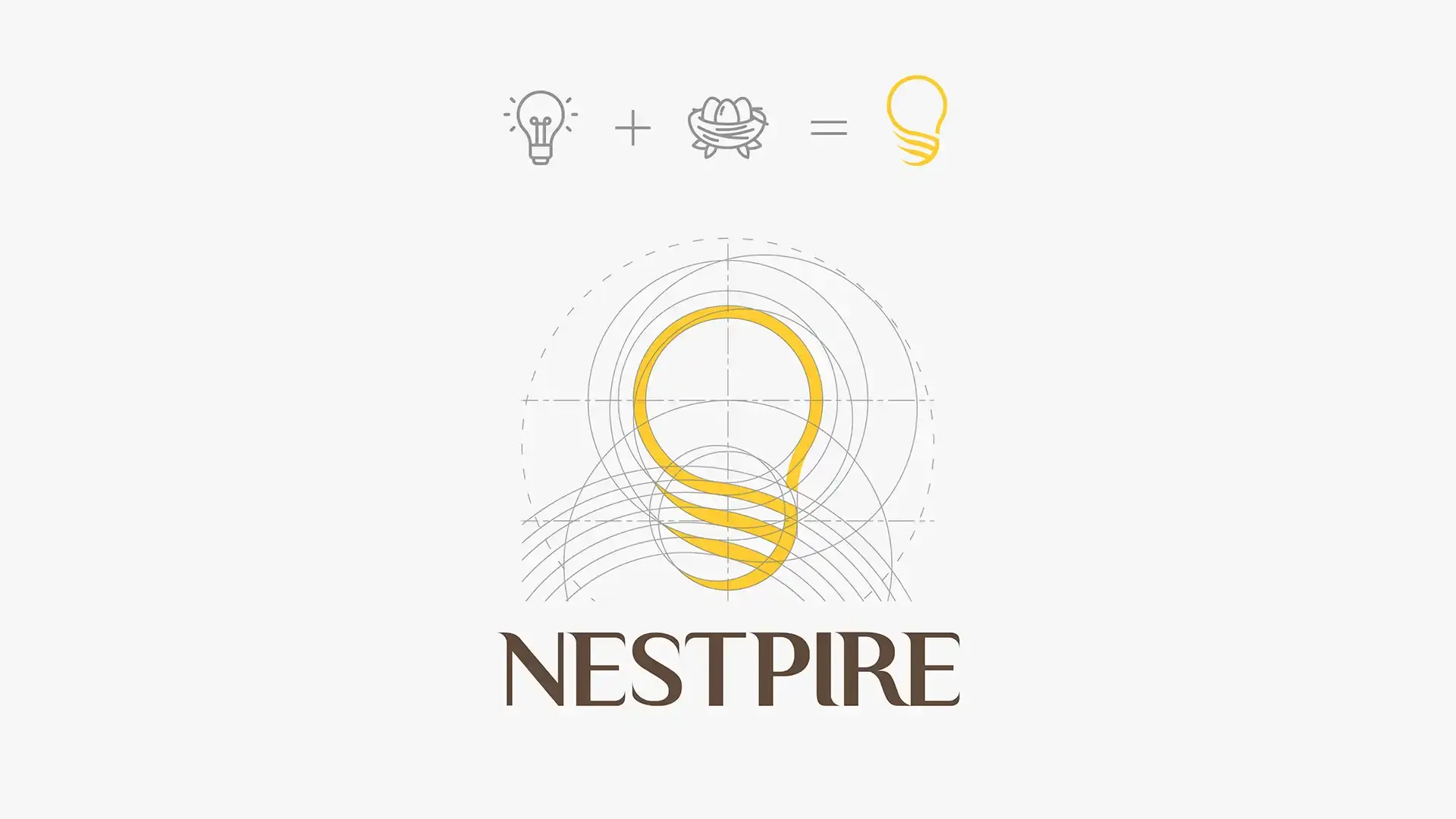
This project involved the brand identity design for Nestpire Workshop, covering logo design, visual system development, and brand applications. As a workshop-based brand, Nestpire needed a distinctive, credible, and adaptable visual identity that could be applied consistently across different activities, promotional materials, and physical touchpoints.
The design was not only focused on the appearance of the logo, but also on the logic behind the brand symbol. By considering the brand concept, name meaning, graphic structure, and application scenarios, the project aimed to build a visual identity system that was organised, meaningful, and easy to explain.
Design Problem
A common issue in logo design is that the final mark may rely too much on visual intuition or decorative styling, without a clear structural foundation. For this project, the design needed to address several key challenges:
The brand required a clear and memorable visual identity
The logo could not be created through random or purely decorative lines
Every line, shape, proportion, and graphic relationship needed a clear design rationale
The identity had to be adaptable across different workshop materials and media
The visual system needed to support future brand extensions and promotional use
The design had to be visually appealing, structured, and persuasive
The core challenge was to transform the brand concept into a precise, well-structured, and meaningful logo and identity system.
Design Positioning
The project was positioned around the idea of a precise, rational, and adaptable brand identity. The logo was developed through geometric relationships, controlled proportions, line logic, and structured shape composition, rather than arbitrary drawing.
In the logo design process, every line, curve, angle, and spatial proportion was carefully considered. This approach allowed the logo to function not only as a visual symbol, but also as a condensed expression of the brand’s concept. By giving each visual element a clear reason for existing, the identity became more thoughtful, convincing, and visually coherent.
The brand system was further extended into typography, colour, supporting graphics, layout rules, and application materials. This ensured that Nestpire’s visual identity could remain consistent and flexible across workshop promotions, social media, printed materials, venue graphics, and other brand touchpoints.
Conclusion
Through a systematic logo design approach and a consistent brand identity system, this project established a clear, precise, and persuasive visual identity for Nestpire Workshop. The design emphasised that a strong logo should not simply look attractive, but should be built with logic, structure, and purpose.
By ensuring that every line, shape, and proportion had a clear design rationale, the final identity gained greater depth, order, and credibility. The result was a brand system that could effectively support Nestpire’s workshop activities and future visual applications.