Heep Hong Society Event
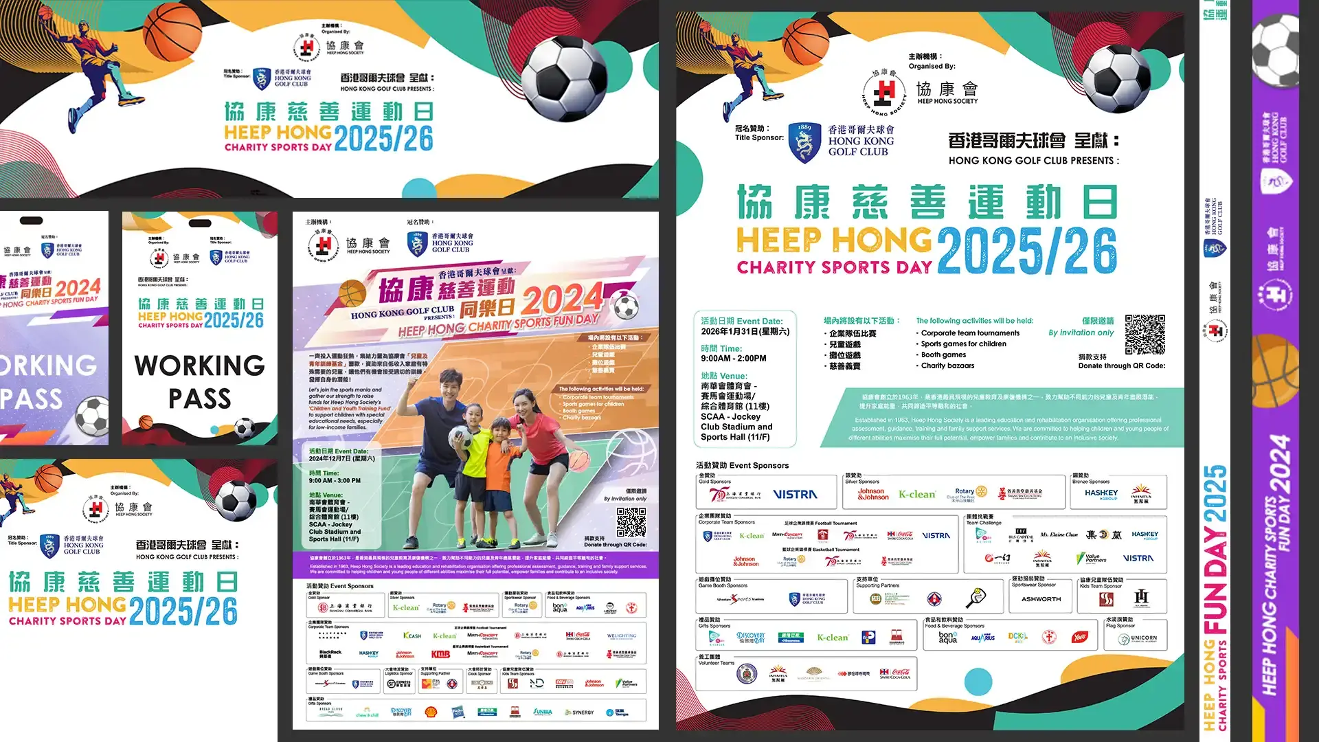
This project covered the design and production of visual materials for Heep Hong Society events, including sports fun days and exhibitions. Using friendly colours, clear layouts, and flexible graphics, the design supported promotion, wayfinding, displays, and participant engagement while maintaining a warm and professional image.
Client
Heep Hong Society
Date
Dec 15, 2025
Author
UC DESIGN LAB
Location
Hong Kong
Background
This project involved the design and production of visual materials for various Heep Hong Society events, including sports fun days, exhibitions, and other organisational activities. Since the events varied in theme, format, and audience, the design needed to create clear, friendly, and adaptable visual identities for different applications.
The work extended beyond a single key visual and covered a wide range of event materials, such as backdrops, signage, exhibition panels, banners, promotional items, staff materials, and on-site decorative elements. The overall goal was to make event information easy to understand while maintaining a warm, professional, and inclusive organisational image.
Design Problem
The main challenge of this project was managing a wide variety of materials across different event types while maintaining visual consistency. The design needed to address several key issues:
Multiple event formats, including sports fun days, exhibitions, and organisational activities
A wide range of material types and production formats
Clear information delivery for participants, parents, volunteers, and staff
A visual tone that felt friendly, positive, professional, and trustworthy
Consistent application across different sizes, materials, and on-site environments
The need to support event atmosphere, wayfinding, and participant engagement
The core challenge was to build a clear, consistent, and approachable event visual system across multiple activities, materials, and physical settings.
Design Positioning
The project was positioned around three key qualities: friendly, clear, and event-driven. The visual direction used warm colours, simple graphic elements, structured layouts, and clear information hierarchy to help different audiences understand event content quickly.
For each activity, the visual identity was adapted according to its theme. For example, sports fun day materials could use energetic graphics, dynamic lines, and lively colours, while exhibition-related materials placed greater emphasis on content zoning, wayfinding, and readability.
Across different material types, consistency was maintained through shared typography, colour systems, graphic elements, and layout structures. This allowed the event visuals to remain flexible while still feeling unified as part of the organisation’s communication system.
Production considerations were also an important part of the design process. Each material had to be prepared with its actual output size, material, viewing distance, installation method, and usage context in mind, ensuring that the design worked effectively both visually and practically on site.
Conclusion
Through event identity design, information organisation, and multi-format material production, this project created a clear and approachable visual system for various Heep Hong Society events. The design supported the organisation’s warm and professional image while improving readability, recognition, and engagement across different event environments.
By applying a unified yet flexible design approach, the materials effectively supported promotion, wayfinding, display, and on-site experience, strengthening the overall identity and communication impact of each event.